Featured

Newbury Family Room

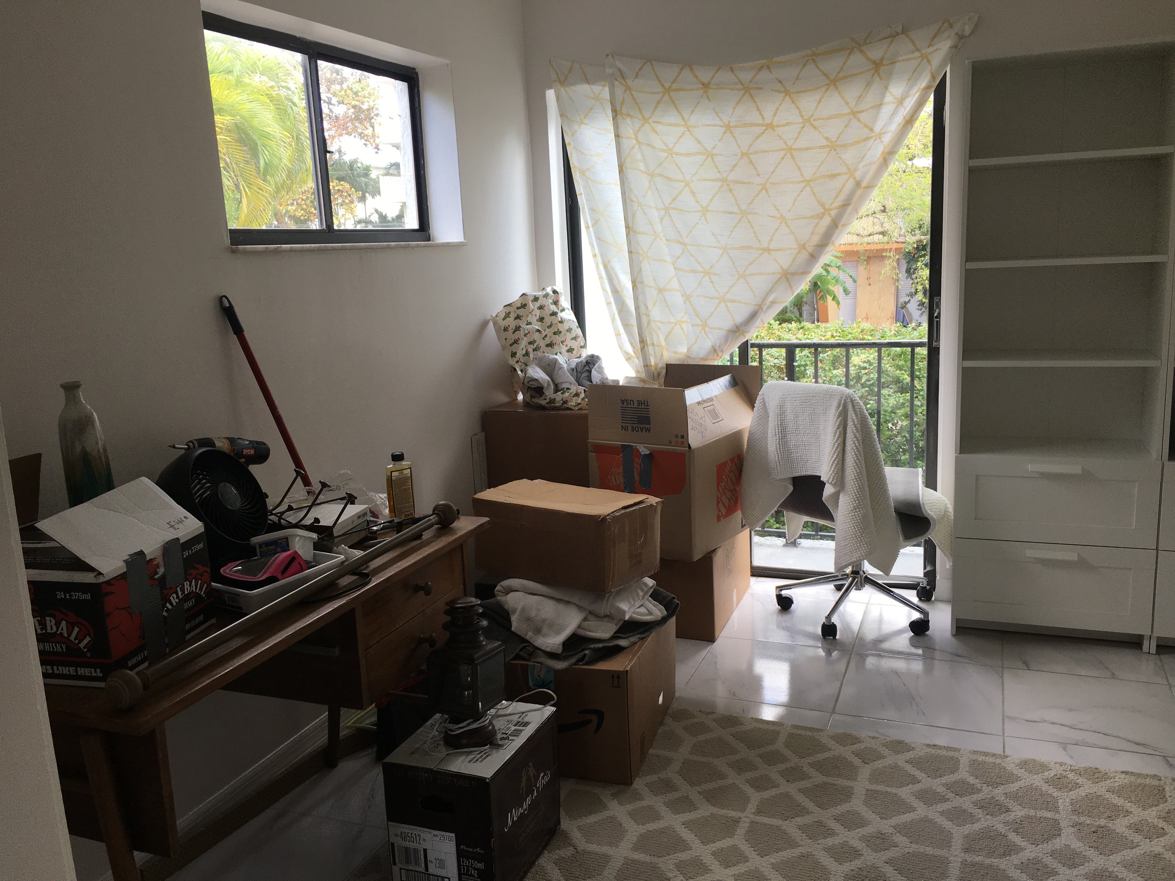
Having lived in Florida for the majority of my life, I’m no stranger to the 1980s/1990s Florida style home with vaulted ceilings, stucco and clay roofs. These homes tend to have strange wall niches and built-in shelves in very hard to reach places and a lot of stone pavers. When my client came to me requesting a redesign of their family room and dated fireplace, I was excited to see what we could come up with.

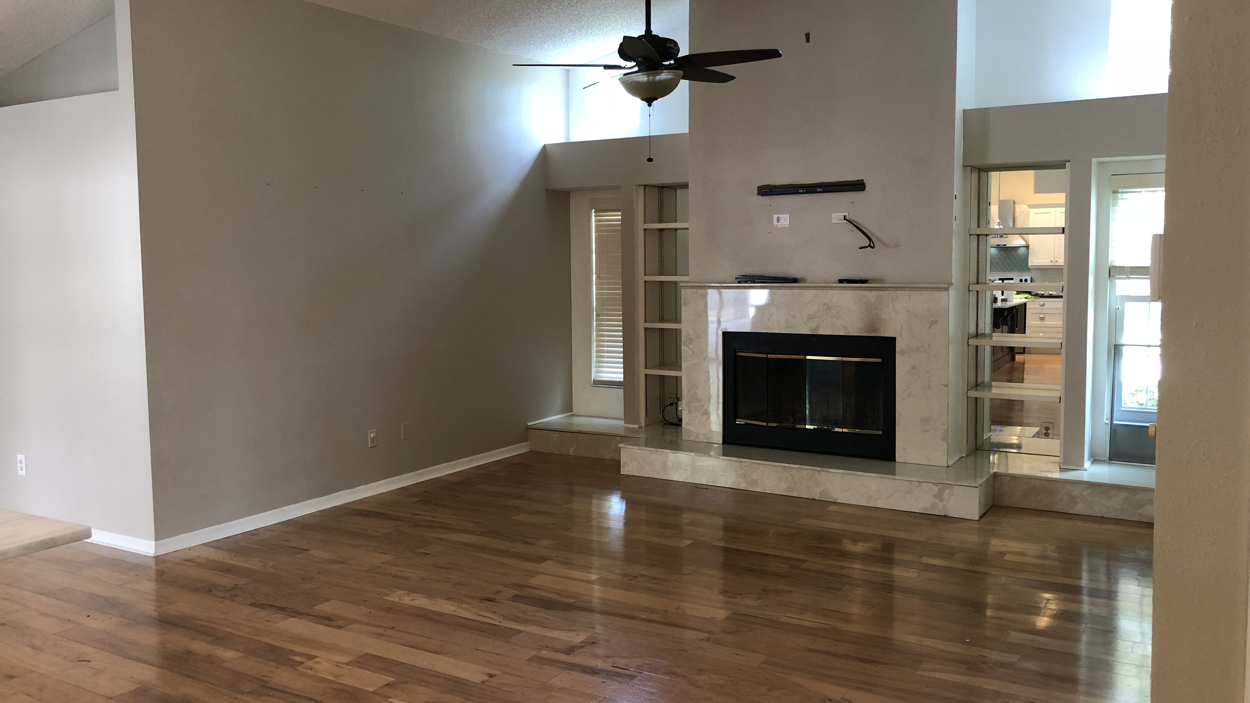
The original design of the fireplace had built-in shelves between the windows and the wall where the fireplace juts out. There was also a long step that went from one end of the wall to other underneath the windows. The finished material was marble look tile. The whole design made the room feel heavy and dated (original photos coming soon). They wanted something that was true to their style while also staying cohesive with the home.

Original Fireplace Design

Starting from a blank slate is quite difficult, so I always start by viewing what others have done in their space for a spark of creative energy. We considered a lot of options including shiplap, herringbone tile, and concrete. I also learned more about firebox, hearth and mantel codes than I ever thought I’d need to! Since this is a wood burning fireplace, we had to follow specific codes in order to ensure fire safety. This meant that some of the things that client preferred, like removing the hearth, was not an option.

Gathering inspirational images and sharing them with the client is really helpful as well because it gives me an idea of what the client likes and does not like. From there I can design something that fits their style and their space. We looked at a lot of images for inspiration but landed on these two below as our jumping off points.

Design and Photo Credit Unknown.
Design: Kelsey Leigh Design Co. Photo: Emily Hart
Cast Stone Fireplace with White Oak Mantel

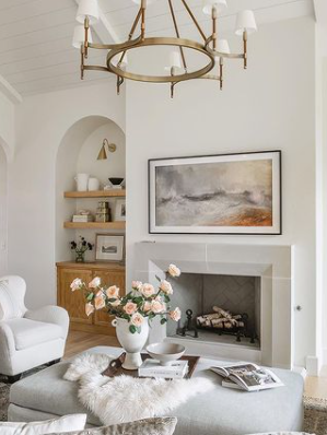
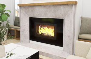
The cast stone in Kelsey Leigh’s design is absolutely stunning and the window seats flanking the fireplace in the design on the left inspired the window seats in this design. I also have to mention the scale and use of paint here to create depth is genius (I am having difficulty finding the original designer of this room and would love to credit them! Comment below if you know!).

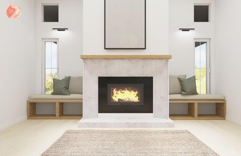
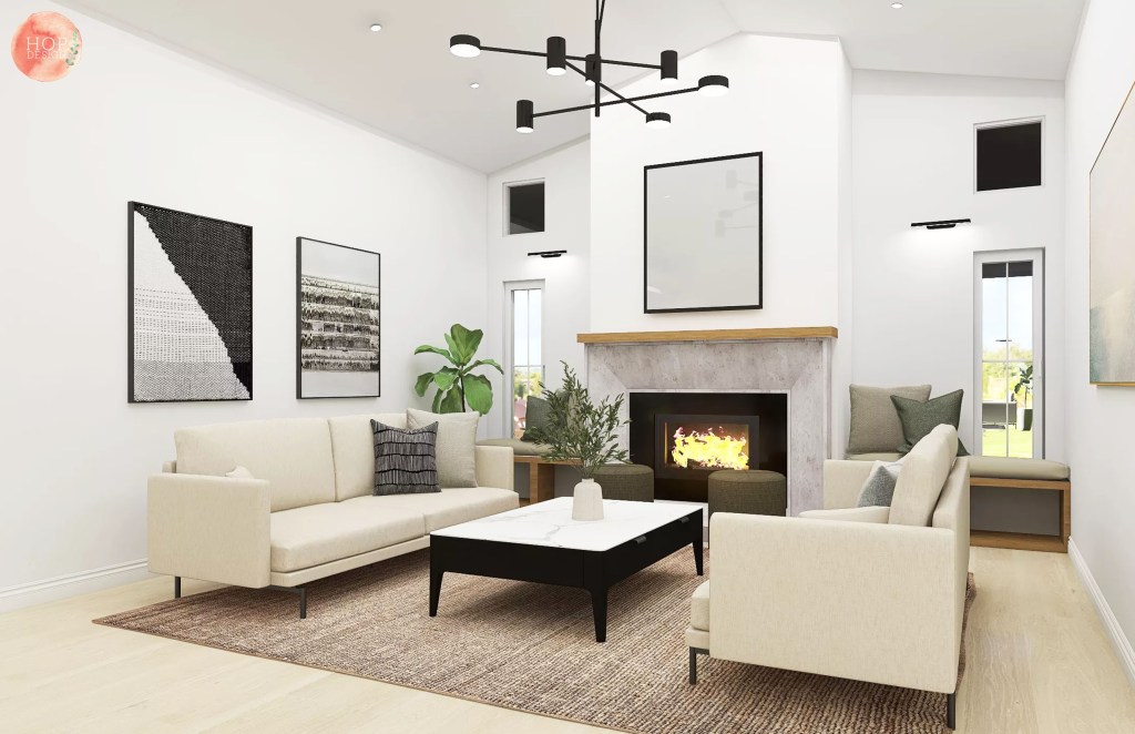
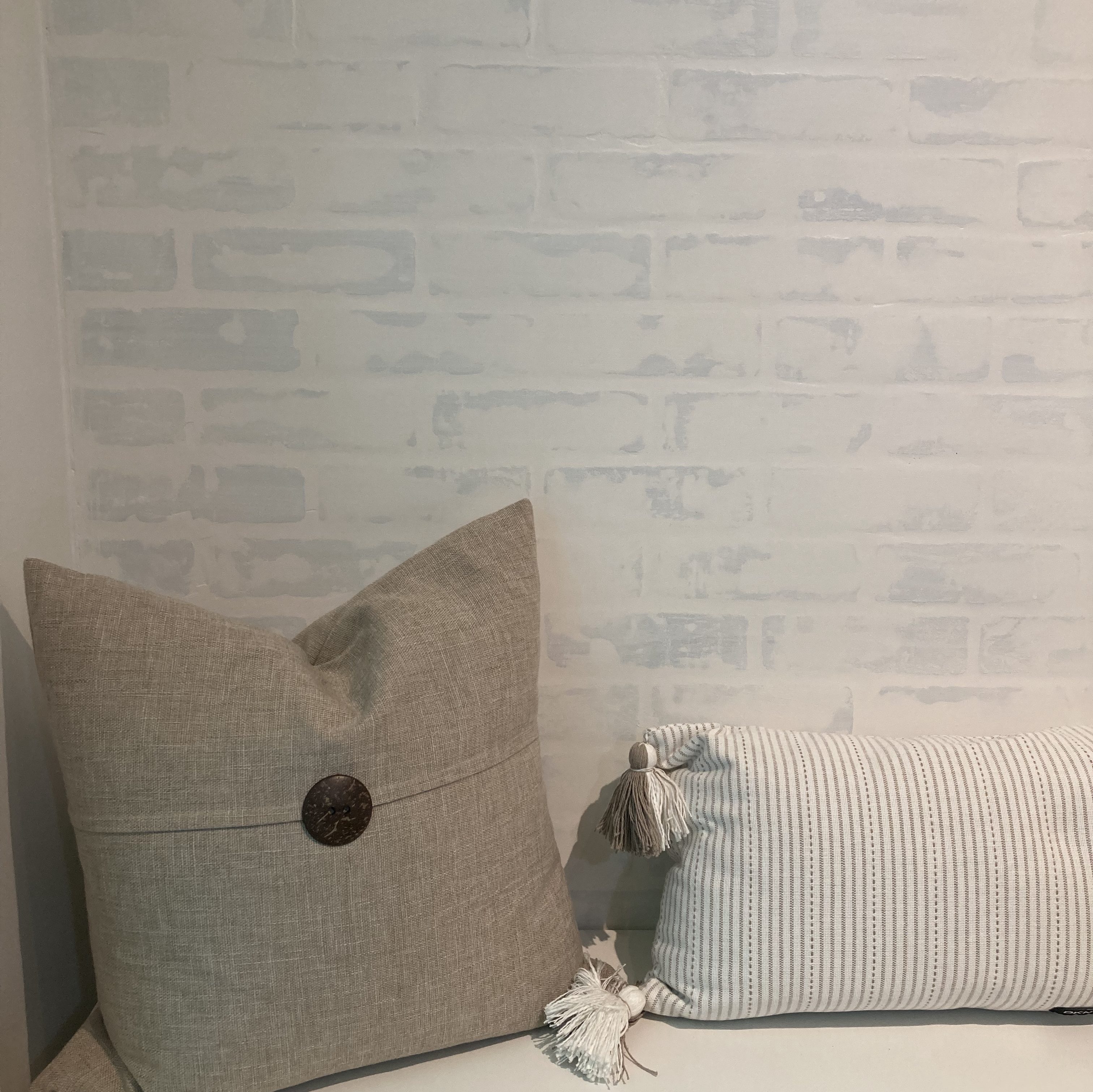
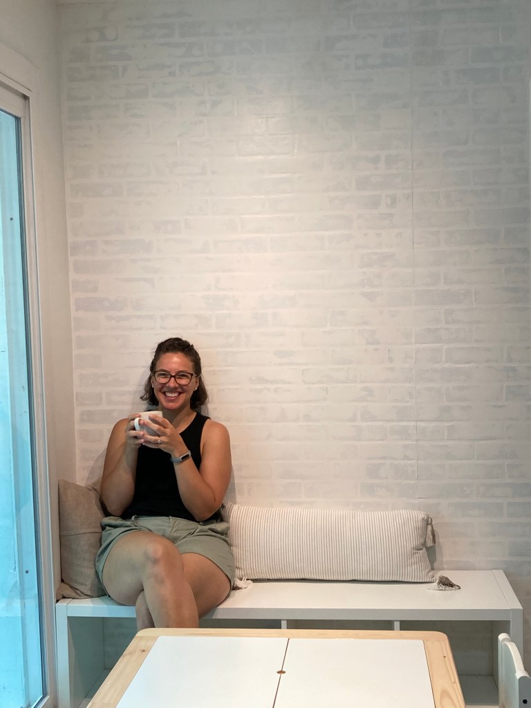
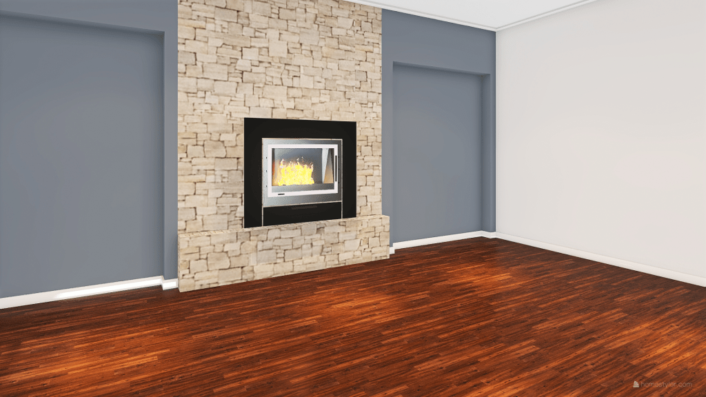
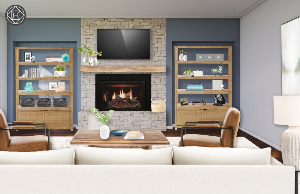
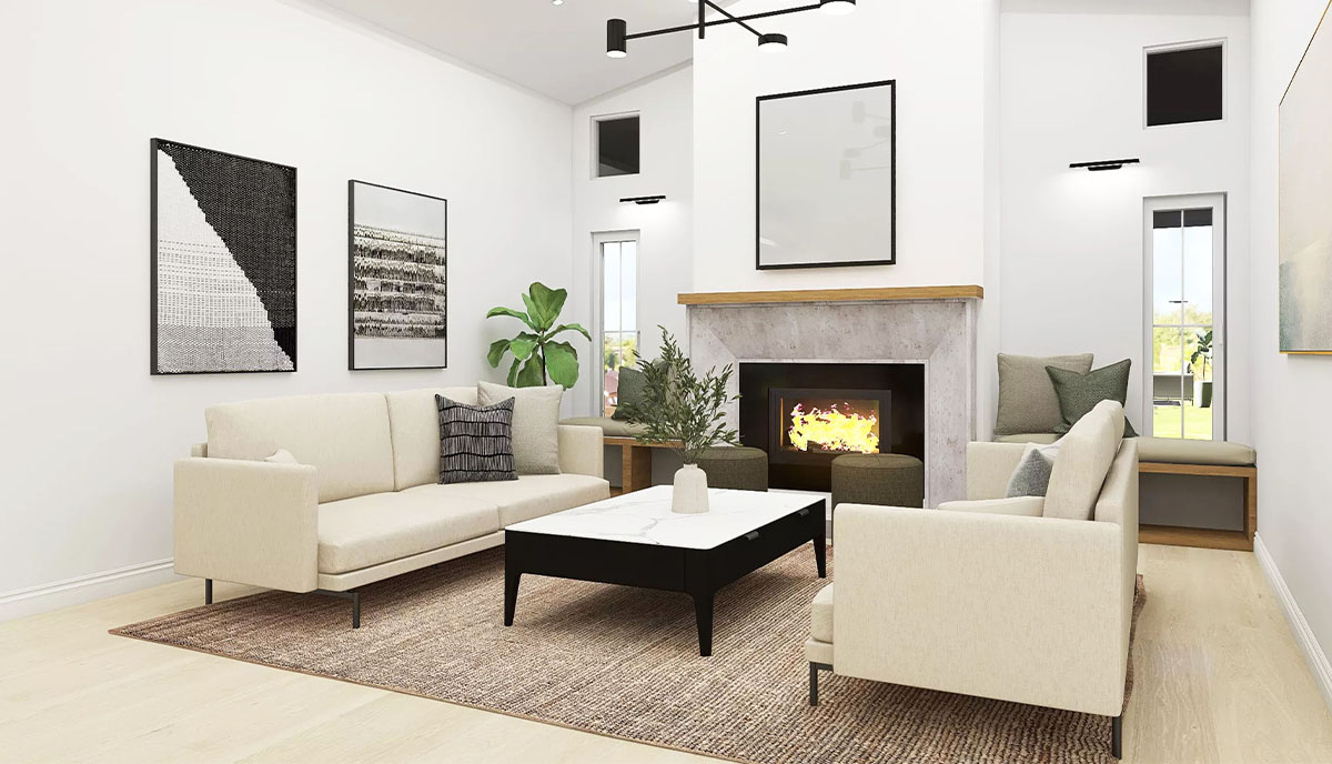
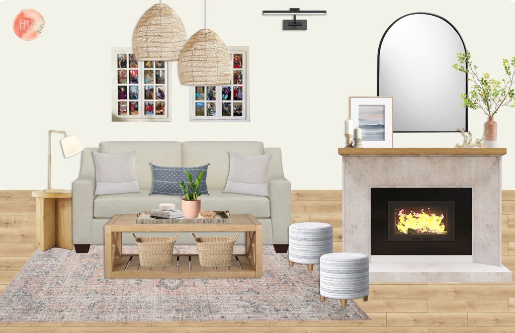
Using these two images as inspiration, I designed the fireplace and window seats to meet the style preference of my clients. The design is modern and utilizes stone which fits well with the other materials in the home. I added a white oak shelf to mantle to add some warmth and to meet the needs of clients. They had requested something a bit more earthy with texture from natural wood. I removed the built-in shelves and step and replaced it with some window seats that have storage underneath.

Since their ceilings are so high, I added a black picture light above each window to help break up the wall and create a horizontal line to catch your eye and some dramatic lighting to fill the space where the vaulted ceiling is.

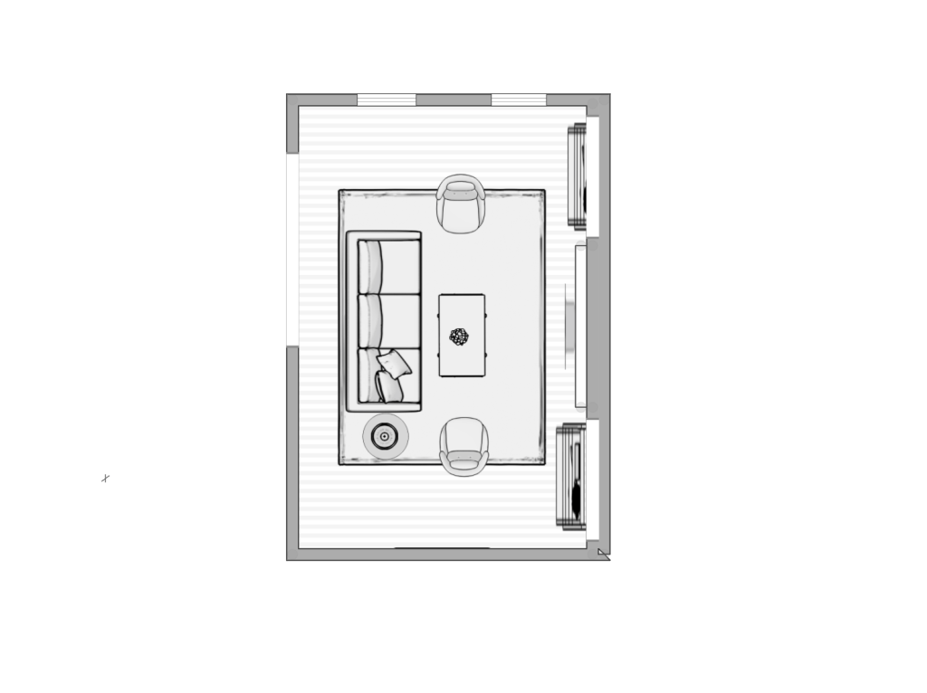
The clients requested a layout to would provide ample seating, not only for their family of five but also for guests. This space is connected to their open kitchen so they felt it would be the most common gathering place. Striking a balance between cozy but minimal is tough, especially when a lot of seating is requested.

Layout

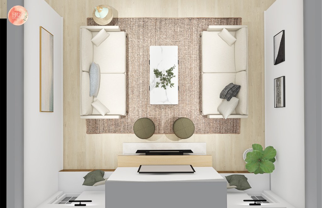
After going through several layouts, a symmetrical look with two large sofas facing each other felt the most appropriate to maintain minimalism but with ample seating. For visual interest, I added some ottomans which can also provide additional seating when it’s a full house.

In addition to providing a fireplace redesign and a layout, the client requested a shopping list for products that meet their style and give them a unified look. While the result seems easy, putting together a “mood board” and shopping list is quite tedious involving a lot of decisions.

Scale, dimensions, balance, color – it is so much to think through and so easy to make the wrong choice. For example, a 36″ tall mirror versus a 48″ tall mirror seems like a minor difference, but it’s the small things like this can throw off the whole room. When you have such high ceilings and a fireplace that is a focal point, you need something decorative above the fireplace that will match the scale of the ceiling height. Also, I went with a rounded top on the mirror because of the asymmetrical line on the ceiling and a round line on the top of the mirror is easy for your eye to process, otherwise there would be too many stopping and starting points. Its all quite technical, but these are the little decisions that make the space come together!

Mood Board
During Construction

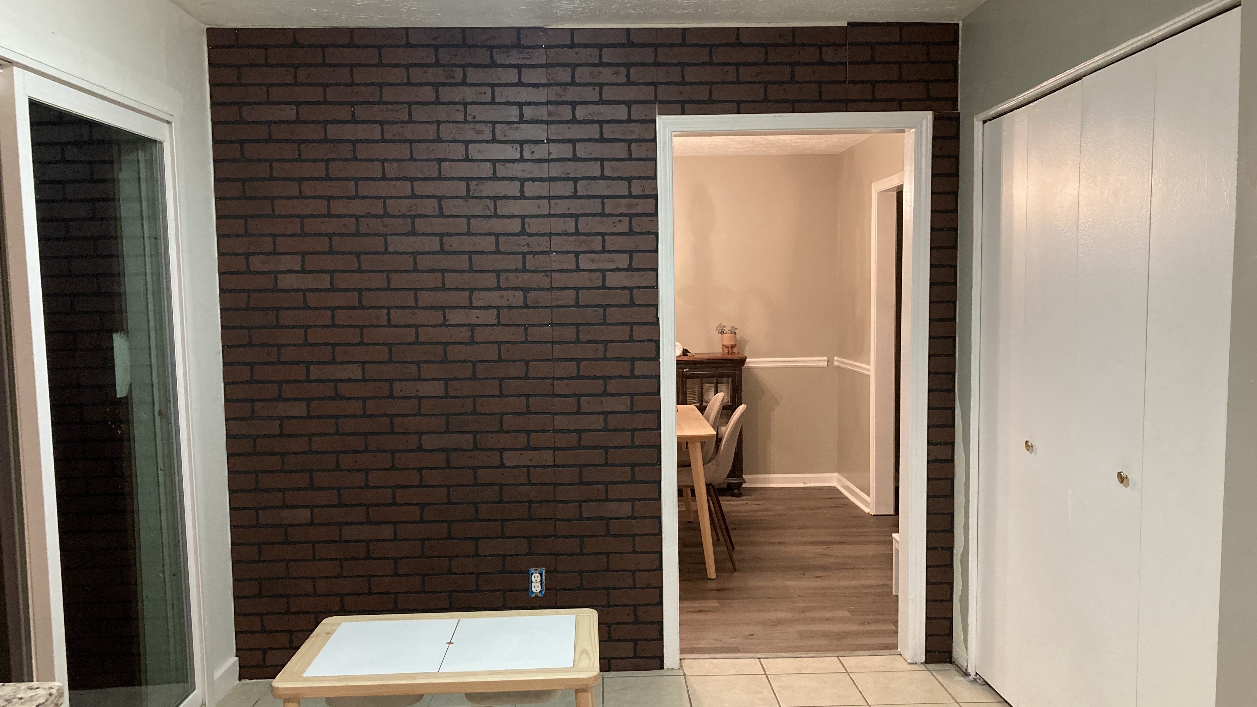
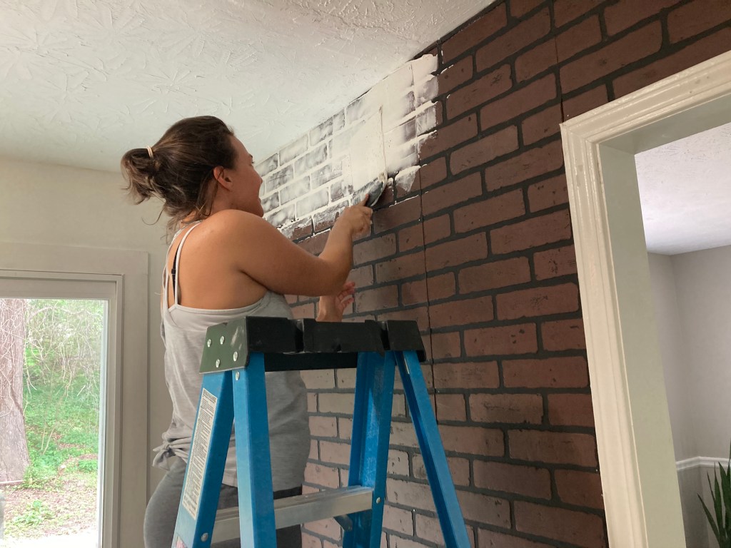
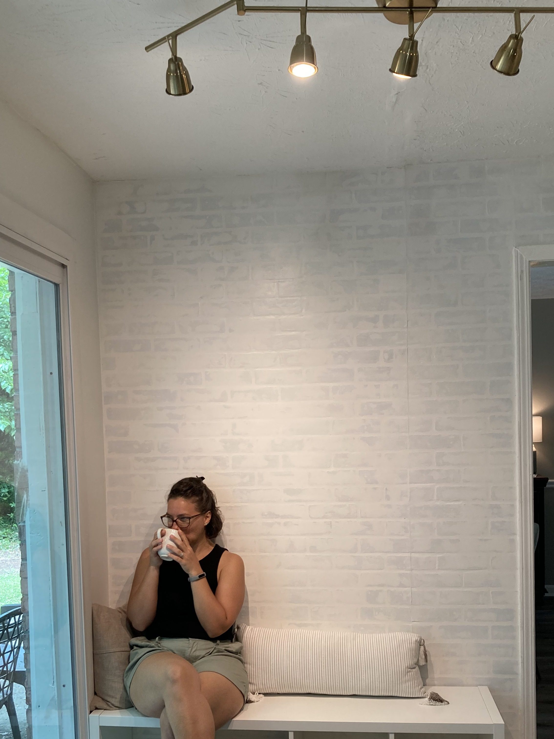
This room is currently under construction and awaiting furniture. Like all things with Covid-19, lead times are extra long so we won’t see furniture in this space until September.

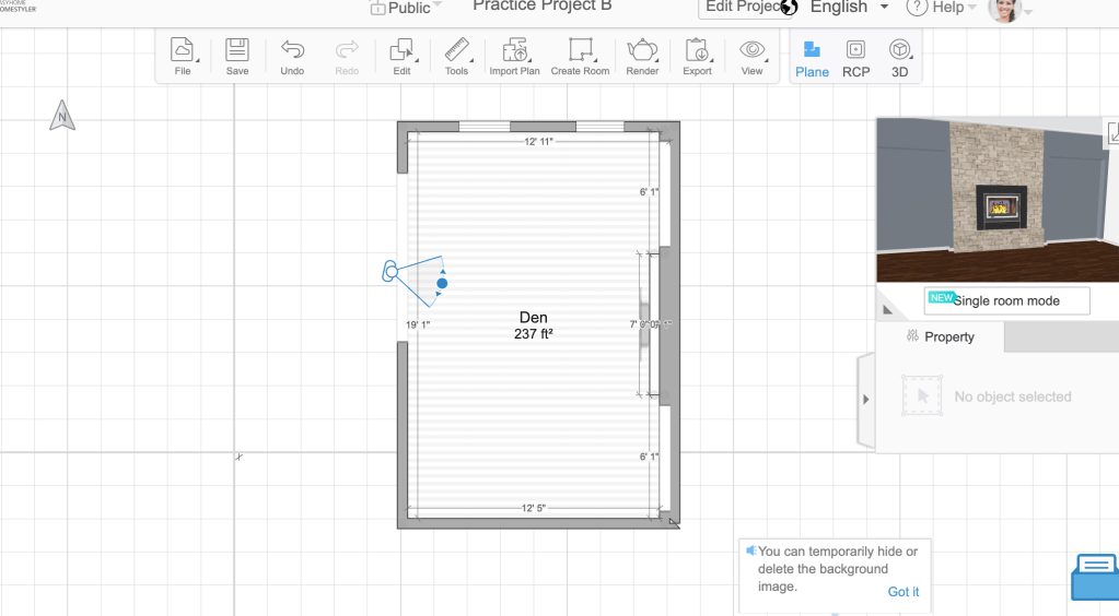
If you want to update your dated fireplace or find the best layout for your space and family needs, I’d love to help! Having digital renderings of your exact space is such a game changer when it comes to remodeling, saving you time and money since you know exactly what the result will be before making big changes. Check out my services page for more info!

Featured

The Den Guest Room

I absolutely love hosting people. It brings me so much joy to welcome friends and family into my home for dinner or an extended stay. When we lived in our one bedroom in Little Havana, I always felt I could not host as well as I wanted to; the layout was just poorly designed for guests. While a bathroom en suite is awesome for the home owner, if that is the only bathroom, then having guests makes things awkward. I have always kept my space clean and had no issues with people going into my bedroom, but I noticed that guests often didn’t feel comfortable entering into such a private space.

When we moved into our rental townhouse in the Mimo District, we were through the moon to have not only two bedrooms and a full bath upstairs, but also a full bath and den downstairs. The den is behind the kitchen, with a small full bathroom attached to it as well as sliders that exit to a small back porch. As soon as I saw this room, I knew it could be easily used as a guest room.

Before:

After:

I hardly ever get to start a room with a completely blank slate, so I had a lot of fun with this project. The style I was going for was a mix of Scandinavian, Boho and Modern. I knew I wanted some sort of day bed since the space was small and I wanted to be able to use it when I did not have guests. Ikea came to the rescue for me with providing something both affordable and beautiful. The Utaker beds could not be more perfect: minimal, beautiful, affordable and functional.

These frames are two twins that stack on top of one another. When they are unstacked, they can be connected to make one king size bed, or use them separately for two twins. I ended up purchases mattresses from Amazon since they seemed to have better reviews and a lower price point. While the frames require thin mattresses (5 inches or less), my husband and I have slept on these to test them out and I have been impressed by how comfortable they are for such a thin mattress.

In addition to the beds, I also purchased a pair of Ikea Brimnes bookcases to create a built-in sort of look. I do not love the pulls on the Brimnes bookcases, so I swapped them out for black metal pulls to add some contrast. Changing out the pulls was an easy and affordable way to give the bookcases a more sophisticated and custom look.

One of the mistakes I made in this process was purchasing linens for the beds before knowing what I was going to do for an area rug. The main colors I am using in this room are white, navy blue, blush pink and black. On impulse, I purchased navy blue bed linens while I was at Ikea. Days later, I found a 100% wool, navy and white stripe area rug at T.J. Maxx for only $99! What a steal! I some how managed to carry that rug to the car, thrown over one shoulder, while pushing my one year old in the stroller with the other hand. Once getting it in place, it was like a sea of navy blue had risen up from the void and overtook my senses. Thankfully you can return pretty much anything to Ikea with a receipt within 365 days. White linens on the bed are a much better choice for the look I was going for in this space.

The final touches really made the space come together: the black pendant lamp from Ikea, the plant stand holder from HomeGoods, the snake plant from a local nursery and framed poster of succulents that I purchased from a local art store for only $5. The final result is a peaceful place where I can sit on the floor and color with my toddler or host two guests for an extended stay.

Featured

The Closet Nursery

When I got married, my husband and I found a beautiful and affordable apartment in Little Havana. The apartment itself was in an older building, and many of our neighbors had been living there since they arrived from Cuba in the 1960’s. Within walking distance to famous Calle Ocho, it was a very fun and vibrant community, full of older Cubans, Central Americans, transplants and tourists.

Apartment Layout

Within a month after our wedding, I got pregnant. While the timing of it wasn’t planned, we were thrilled to have a baby! We were not interested in moving, so I got to work planning on how to make our one bedroom accommodating for our little bean. While our apartment was small, there was a large closet in the master suite and the bedroom was large. My idea was to empty our closet, and build an open closet on an empty wall in the bedroom.

As you can see from the layout, we had very limited storage to begin with, so giving up our large walk in was a bit of a sacrifice. We didn’t even have a linen closet, so in addition to storing clothes for my husband and I, we also had to store all of our linens in our walk-in. Losing our closet for storage forced me to press into my value of simplicity and creativity more than I ever had before.

Before:

After:

The first step in this process was moving our clothes and linens from the walk-in, to the new closet space in the bedroom. Ikea came to the rescue with Algot, an affordable and customizable closet and storage space solution that attaches to the wall (which they unfortunately not longer sell). I used the online planning tool on the Ikea website to figure out which pieces I wanted for the wall and purchased everything in store. It was a fairly simple process to assemble, but requires power tools and knowledge of wall materials to properly attach to the wall. When we moved out of the space, we actually left the Algot behind because my landlady liked the set-up!

Since this closet was visible from my bed, it needed to be pretty. Seeing chaos when you first wake up is like starting your day with a bad omen, so I invested in wooden hangers (Ikea). I also purchased a variety of storage boxes and hanging organizers from Target by Made By Design. The design of these coordinated well together with Algot from Ikea, resulting in an affordable yet, pretty-to-look-at closet.

The next step in this process was figuring out how to turn the closet into a nursery. While the closet was big enough to fit a standard crib, it would have taken up the whole space, which is not what I was going for. In my research phase of the design process, I discovered “mini” cribs (who knew?) and settled on purchasing the Origami Mini Crib by Babyletto, which I found used for only $75. This crib folds together, so moving it and storing it is a breeze. I also purchased a small glider from amazon, which has been more durable and comfortable than I thought it would be. After a year and a half of using it multiple time per day, it still works well, has not stained and is one of the more comfortable chairs that I own. From a design perspective, I would have preferred something more modern, but this is the only chair that rocked, fit inside the small space and you just can’t beat the price.

To add in color, I had originally wanted to buy peel and stick wall paper to put on the one back wall in the closet. When I was pricing it out, it was just more than I wanted to spend so I kept putting it off. On a trip to Target, I found a colorful rope rug by Pillowfort that fit the dimensions for the closet perfectly. When I got the rug in place, it provided so much color that I decided against doing the wall paper. I finished out the space with a flisat wall storage shelf for books (Ikea), some pink and gray fabric storage bins (Marshalls) and some watercolor paintings. The painting in the center is from Marshalls, the two on the right are my own handiwork. The end result was turning our one bedroom into a one and half bedroom, thoughtfully prepared for bundle of joy.

When we moved out of this apartment, getting things back in order was very simple, especially since our landlady wanted to keep the Algot Closet in the bedroom. I simply put back the closet dowel rods (which I had stored under my bed) and I was done. All in all, it was a very renter friendly solution to needing a nursery for an unexpected, but very welcome new member of the family.

Featured

Kid’s Playroom at Nana’s

Sometimes I lie awake at night, rearranging furniture in my mind or imagining how I would update a kitchen or bathroom in the house I grew up in. One of my earlier projects was helping my mom remodel the playroom in her house. I have seen this room take on many identities over the years. It is fun to see how it first started out as a bedroom for my brother and then became a playroom for his children when they visit! The room had kind of become a catch all for different items in addition to toy storage and beds for sleepovers.

Before:

After:

Bedroom Layout

This room has always been a bit complicated when it comes to placement of furniture. There is a large bay window on one wall and a closet on the back wall. So putting any bed larger than a twin means you’re blocking the entry, the closet or the window.

Placing two twins in this room was the biggest challenge but we got lucky with the bay window wall being just wide enough to put two twins end to end along the wall. We had zero inches to spare to get these beds in place so we literally had to wedge them in. Imagine a draw bridge being lowered, but two twin beds instead. That was me and my mom fitting these beds into place! I also put a fitted sheet over the base of the box spring to give it a more clean and finished look. The end result was a fantastic wall to wall couch!

The bay window needed some help as well. The wood surface was scratched in some places and the varnish was peeling off. While at Home Depot we passed by sheets of laminate and thought that would be a durable and cheap way to cover the bay window surface. My mom had her handyman install it and the result was better than I imagined.

We also replaced the old, brown bifold closet doors with a simple gray curtain and organized toys and books with some cube shelf storage. My main responsibilities with the space was thinking through furniture placement, organization and painting. My mom picked out the linens, table top and wall decor and adding the fun salt lamp. The end result is a lovely mix of clean lines, eclectic pieces and a peaceful setting for children to sleep and play.

Make a Statement With Your Gallery Wall

Visual art has the ability to convey messages to us in ways that can be easier to understand than through traditional ways of learning. As a White and Puerto Rican woman, I grew up seeing images of White women in advertisements that conveyed to me what the ideal woman was, and I looked nothing like her! But times are changing – at least in some advertising. I stopped dead in my tracks in Target one day when I saw the 2019 swimwear ad in the store. It was nothing like the images I saw growing up. Some of the women had my hair texture, some even had my body shape and size. To see this as an adult did something deep for my psyche – I felt seen and valued. High five, Target!

When a client requested art for his gallery wall that would speak to the cultural experiences of his two children, I could not have been happier. Just thinking about his Multiracial (White and Black) son and daughter growing up surrounded by images that celebrate and honor their culture filled me with excitement, especially during this cultural moment. I felt honored to participate in this deeply personal and developmental art display.

I chose to source the majority of the work from society6.com because I wanted to support Black artists and society6 has a page exactly for this purpose. Society6 makes it easy for new artists to put their work out there since they take care of all the sizing, shipping, and processing of orders. Artists just do the art, which is great for someone just starting out.

There is so much out there to choose from but I narrowed down the gallery wall selection by color of artwork, variety in the design and content. Since the client has a son and a daughter, I wanted to make sure both men and women were represented, and since they are children, the gallery wall had to speak to both the young and grown. I landed on the four fabulous works here and then added in a few other things for variety. In order to create the shape I wanted for the gallery wall, I had to order the Andre and the Justice artwork as prints so I could customize the size of the frame.

Society6 has some standard sizes that they print and frame in, so this made things a little tricky to get exactly right for the gallery wall but I made it work. The result is playful, deep, and beautiful. This project has inspired me to be more thoughtful about artwork and what is displayed around my home, to not just see artwork as an aesthetic but as a method of communication. For help on your gallery wall, check out my services page

Faux Brick Wall

When we moved into our house in January I immediately knew the wall between the kitchen and dining room had to go. It wasn’t high on the priorities list but as a person who loves to host others, I knew there was no way I could fit a large table in a small dining room, and I desperately want a large table in my dining room!

View 1 of Wall | Before
View 2 of Wall | Before

As luck has it, the wall is load bearing, contains plumbing AND of course electrical. I was quoted at $8k to remove the wall. Yikes! Well, that’s not happening any time soon (or maybe not ever). So I had to find some ways to make this wall more attractive so that it would not remind me on a daily basis that I can’t have a huge table there instead.

Through one of my rabbit trail internet searches I came across folks who created faux brick walls as both accent walls as well as an alternative to tile for a kitchen backsplash. Since I have brick on the exterior of the house, it seemed like a great idea to bring this into my home to give the kitchen some character and interest while keeping a cohesive look. I also wanted something that could be easily removed in case I do decide to take out the wall at some point in time. Going faux was the best route for me.

The result is NIGHT AND DAY! What a difference! While I would still prefer a large table and no wall, I am VERY happy with the end result and find this little space perfect for my family’s needs. I can sit and view wildlife out in my backyard through the sliders and my two year old has a dedicated space for play. Check out the result below and just keep on scrolling if you’re interested in the how to! If you have a design dilemma, check out out my services page!

After
After
After

DIY Faux Brick Wall

What you’ll need

How to do it

  • Measure. Decide how much wall you are covering by measuring your wall and decide ahead of time how you will piece together the 4 x 8 ft sheets. I had a walkway in mine, so I had to cut up a few small pieces from a large sheet. Deciding this ahead of time was helpful for me.

  • Prep your wall. Make sure your wall if free of debris so that when you use your adhesive you get a good bond. Also, turn off the breaker to this part of your home and remove the covers of your outlets and unscrew the outlets. You don’t need to remove them completely, but I found it helpful to have them out of the way.
Before | I scraped wall paper and had to repair some wall damage. Very unsightly.

Cut and Secure to the wall. Decide where you will put the panels. I had one large one that needed to be trimmed on top so I started with that one first. Then I secured that one to the wall with construction adhesive and a few nails before measuring and cutting the next piece. I followed the same pattern: measure, cut, then secure in order to make sure my piece would fit perfectly.

Faux brick panels before applying joint compound
  • Apply joint compound. I almost left this part out… DO NOT LEAVE THIS PART OUT! Since I wanted to white wash the wall and give it a German shmear sort of technique, the joint compound helps to create that aged finish. Use the joint compound to fill in all the gaps and give the wall a bit of a smoother finish. Its a little tricky at first to know how much to put but the compound is forgiving. If you put too much, you can use a wet rag to wipe some off. This part is about finding the look you want.
Applying joint compound. This is very similar to icing a cake.
  • Paint. Give your joint compound some time to dry (exact time depends on specific compound). I just left mine to dry overnight. If you want a white washed look, you can make your mixture using 50% paint and 50% water. You do not need a lot of this, I actually made too much so I’m trying to figure out what else I can white wash around the house (I see you stone hearth!). Start with a smaller batch, you can always make more. While most everyone recommends a 50/50 mixture for white wash, I found it to be too opaque and ended up adding some more paint. I did four coats of this on my wall because the joint compound really soaked it up. Don’t skip this step either because the joint compound needs to be sealed.
  • Add outlet extenders. If you had an outlet in your wall, now is the time to add your outlet extenders. Follow the instructions that come with the extenders and your outlets will now sit even with the brick panel. If you skip this step, I promise you’ll regret it. The outlet covers won’t fit well over the outlets and your new wall will look really funny.
  • Capture. Enjoy your new brick wall and capture the moment! Post on instagram and tag @hellohopdesign. I want to see your handiwork!

Havenly University Training

I love to learn. There is something comforting to me about knowledge, information and gaining new skills. My main source for learning has been the public library. In addition to physical books, the library has an incredible amount of online resources for learning as well, all for free!

Another free resource I recently discovered is Havenly’s training program they provide for anyone interested in learning how to create a floor plan using Homestyler and create a realistic 3D model of a design concept. You can learn more and sign up here.

The training is broken up into two components, 1) the basics of photoshop and 2) Homestyler.com. This was my first time using either program so I was a complete beginner. I got through all the training videos and practice lessons in about five days (staying up late at night after my baby went to sleep). Homestyler was definitely the easier application to use and while I didn’t have a problem learning photoshop, it is incredibly technical and a lot to remember. I found myself going back to the training videos a couple of times while I was working on my final project.

What I was able to do in Homestyler is create a floor plan that you can see in both a birds eye view and a 3D realistic view. Here is the unfurnished floor plan I created in Homestyler.

Creating something from a blank space is an incredible feeling; it makes me think about the scene in Frozen where Elsa uses her abilities uninhibited for the first time and creates a stunning ice castle. Every time I watch this scene with my daughter, I feel inspired. I want my daughter to grow up pressing into creativity and knowing what she is capable of, and I want that for myself too. Learning how to use Homestyler (and SketchUp too!) provides me with an outlet to see what I am capable of. I may not be building ice castles, but I’m only getting started!

What I like about Homestyler is how easy it is to add furniture to a floor plan and move it around to discover the best layout. I can’t tell you how many times I have moved a sofa around a room trying to find the best spot for it. Homestyler gives you the ability to lay everything out and see it from multiple angles. Here is my room furnished in Homestyler.

The purpose of learning photoshop for interior design is to create a concept board for a design. Havenly takes it a step further by taking the renderings of the floor plan from Homestyler and manipulating them in photoshop with the actual items that you will purchase for the design of your room. The result is a realistic picture of your redesigned room, so there is no guess work for the client. The client knows exactly how to style that new coffee table! Here is a picture of my Homestyler rendering manipulated in photoshop.

What I loved about this process was the online shopping without spending any money or even looking at the price tag. I just grabbed pictures of items I liked, doctored them in photoshop and added them to my design concept. At one point, I started to get carried away so I had give myself a fake client to apply some parameters. What I decided upon was a client who wanted a relaxing space to read, listen to vinyl LPs, watch TV and just decompress after a long day. I imagined them sitting on the sofa and staring at the various greenery and cozy fireplace to process the day.

If you’re looking to learn something new, I highly recommend taking Havenly’s training program. There is even a bootcamp option if you want more structure and access to a slack channel! The training was worth the time and I plan on using this format for future projects that I will share on the blog, so stay tuned! More beautiful things to come.

The Kitchen Pantry

I love cooking, baking and just experimenting in the kitchen. There is nothing more frustrating to a “make-from-scratch” home cook than limited countertop space. Where am I supposed to knead bread dough when I have a produce stand on my countertop?

During the past eight years of renting in Miami, I have had to succumb to cooking in small kitchens, many of which could only fit one person at a time. But I have always made it work, so I really can’t complain. Now that I am in the townhouse, I have been grateful to have a substantially larger kitchen (comparatively speaking), allowing my husband to wash the dishes, while bake and make more dirty dishes. It’s a great set up!

Townhouse Layout

When we moved in, there was a large empty wall on one end of the kitchen, which had me scratching my head trying to figure out how the space was intended to be used. It is too big for it to just be empty, and too small to fit a table or standard countertop since it is also the walkway into the den. After staring at this wall for months, I knew what was needed. My idea was to add more countertop space, storage underneath and open shelving on the wall. Check out the layout of the kitchen and the 3D model of the vision.

Before:

After:

This project required a bit more labor than my other projects since I built the shelves and the countertop myself. I bought two 1 x 6 x 10 foot pine boards from Home Depot to construct the shelves. I did not need to do any cuts on these, but I did sand them down a fair amount with a power sander before applying three coats of polycrylic. I prefer the look of a floating shelf, but that is quite a bit more work to DIY and I didn’t want to pay to have it done. I resorted to these minimalistic J-shelf brackets that I found on amazon, which coordinated well with the hits of black I have going on in other parts of the townhouse.

I have installed wall shelves many times, so I went into this project feeling pretty confident in my ability, but shortly into the installation, I thought I was going to burn my townhouse down. I was drilling into the wall where I had marked the location of the stud, only to discover the power went out and I saw a small stream of smoke escaping from the hole I had just drilled. I was telling myself not to panic, but I grabbed my 15-month-old and ran upstairs to tell my husband that I might have set the house on fire. After assessing the situation, my husband and I determined that there was no danger and that I had drilled into electrical wire rather than a stud. Needless to say, should you decide to do a similar project, I highly recommend proper assessment of what is behind your wall before you start drilling.

The countertop was made using the same kind of pine board as the shelves, but I had to do a bit construction to get the size I wanted. I wanted the wood top to hang over the bookcases about an inch and a half so I bought one 1 x 12 x 12 ft pine board and one 1 x 3 x 12 ft pine board. I joined them together using a kreg jig to make pocket holes. I filled any gaps with wood filler, sanded the whole thing down and then sealed with polycrylic. It turned out pretty seamless and was fairly easy to do.

I set the wood countertop on two Billy Bookcases with Oxberg doors from Ikea which were the perfect depth to fit the space. I switched out the knobs for black ones to give it some contrast and coordinate with the brackets. I do feel as though I had to compromise on my ideal vision for the space. I would have much preferred to have the bookcases fill the space completely instead of having the gap in the middle, but I was inches shy of fitting three bookcases across. Not to mention I would have to figure out some kind of workaround with the power outlet.

The bookcases are also a bit taller than a standard kitchen counter, so I considered cutting them down to standard height, and then also trimming down the width of one of the bookcases so that I could fit three across. It started to become more and more complex of an idea, and I really wanted to keep this a renter-friendly and easy project, so I settled on keeping it simple with just two bookcases on either end. In the end, the height and gap in the middle bothers me less than I thought it would, and I’m very happy with the result.

The final touches were adding some baskets for fruits and veggies, some dishes I already own, glass containers for dry goods and my beloved espresso machine. The end result is a bright and airy kitchen pantry and coffee bar, that turned an empty wall into a functional powerhouse of beauty. Now, instead of staring at an empty wall and scratching my head, I breathe a sign of relieve to see my produce have a happy home and I think, “Oh! it must be time for another espresso!”